


Table of Contents Show
Turning a plain tote bag into something personal feels pretty satisfying. Painting on fabric lets me play with my mood, style, or even the season—sometimes all at once. If I land on the right design, suddenly I’ve got a tote that’s way more “me” than anything I’d find in a store.
So, here are some ideas I’ve tried (or want to try), from minimal to totally extra.
Each one’s got its own vibe, whether I’m feeling subtle, bold, or somewhere in between.
1. Minimalist line art with black acrylic paint
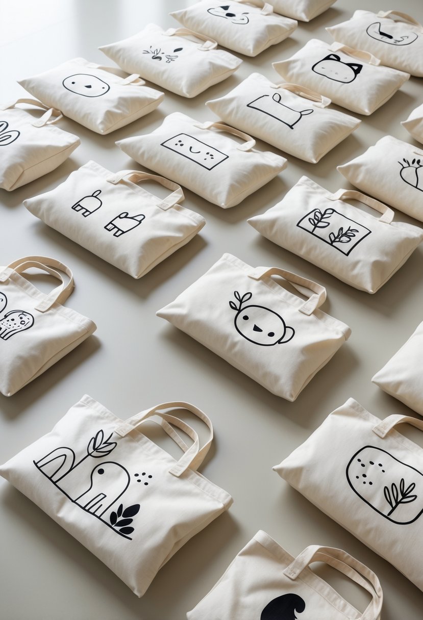
I grab a fine brush and try to keep my lines steady and clean.
Usually, I stick to faces, plants, or just some random geometric shapes.
For People Who Love to Make Things ✂️
Black acrylic pops really well, especially on lighter totes.
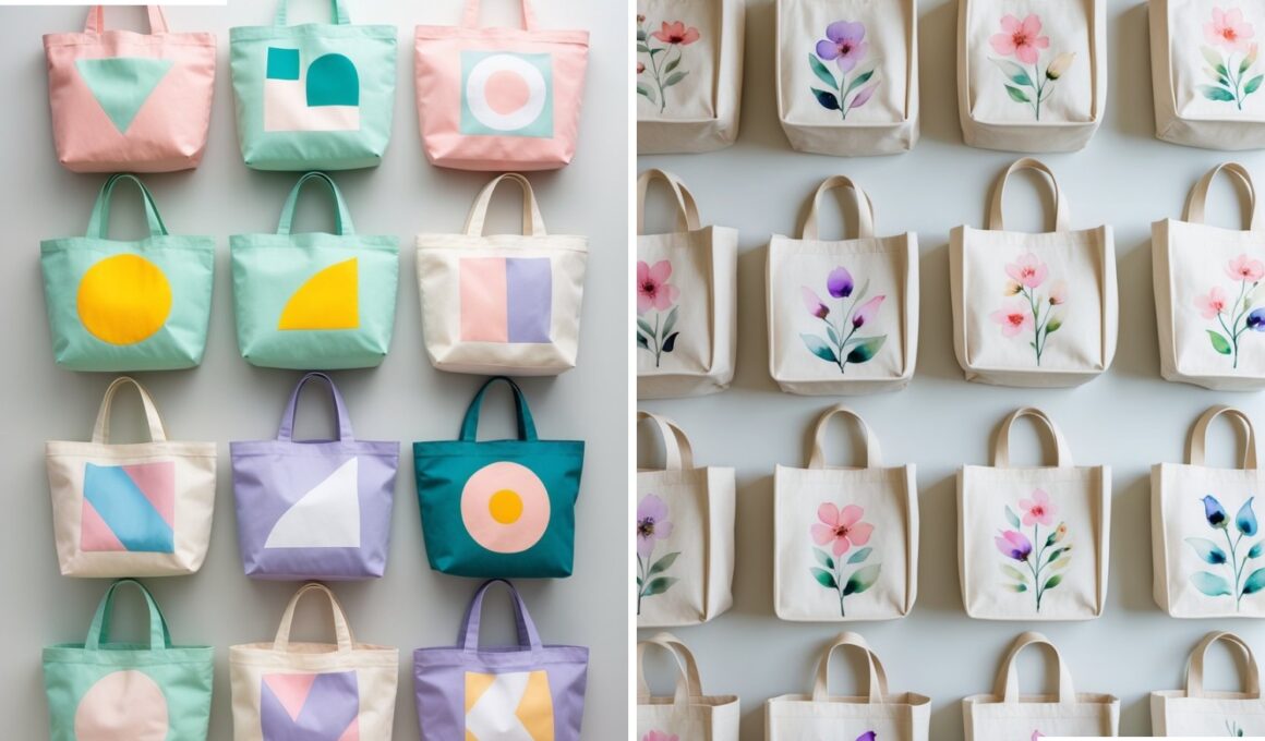
2. Floral watercolor-style blossoms
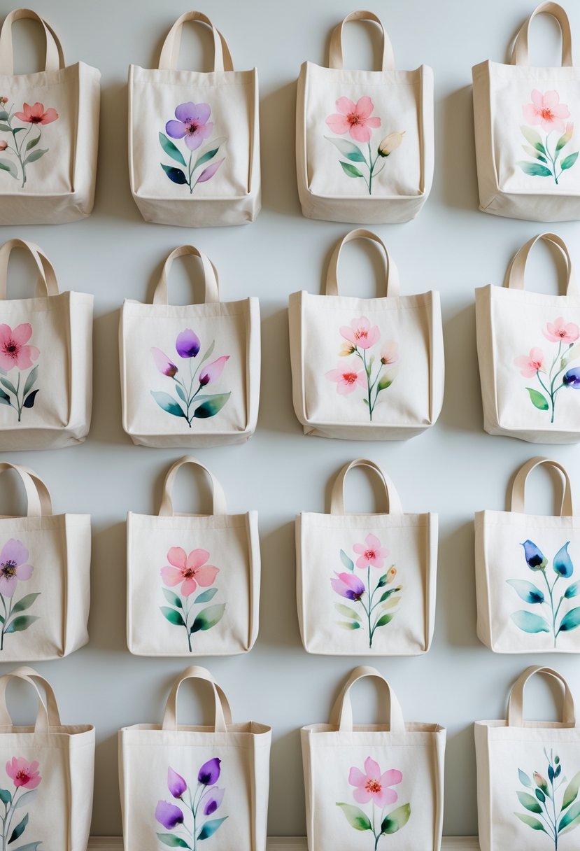
I water down fabric paint to get that soft, layered petal look.
Colors bleed into each other a little, which actually makes it feel more natural.
Light brush strokes help keep everything looking delicate—not too heavy-handed.
3. Bold geometric shapes in pastel colors
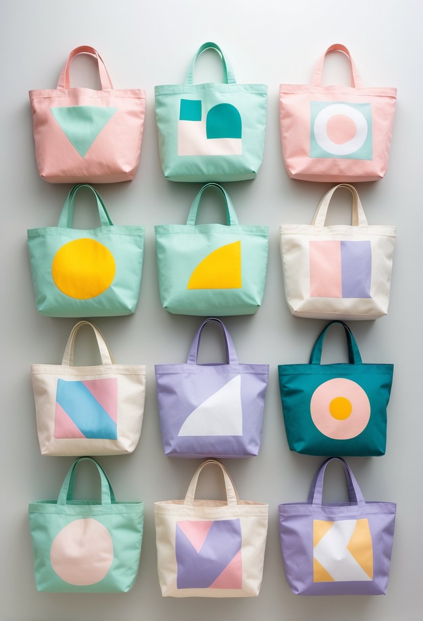
I go for clean triangles, circles, or squares—nothing too complicated.
Pastel shades keep things soft and not too loud.
Balancing the shapes is key, or else it just feels off.
4. Hand-painted inspirational quotes

Short, uplifting quotes are my go-to—I keep the lettering clean and simple.
I pick words that actually mean something to me, and let the message do the talking.
5. Cute animal silhouettes with bright accents
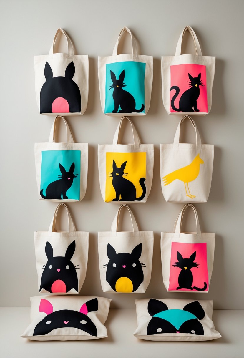
I paint basic animal shapes, usually in black or white.
Then I’ll throw in a pop of color—maybe a bright ear or a patterned tail—just for fun.
6. Abstract splatter paint design
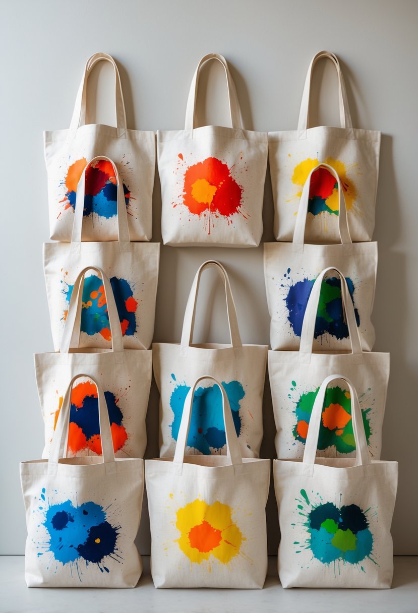
I use a stiff brush (or sometimes an old toothbrush) to flick paint all over the tote.
Layering colors gives it more depth, but I let each layer dry first—otherwise, it’s just a mess.
This style gives off a really casual, artsy vibe.
7. Tropical leaves with green and gold highlights
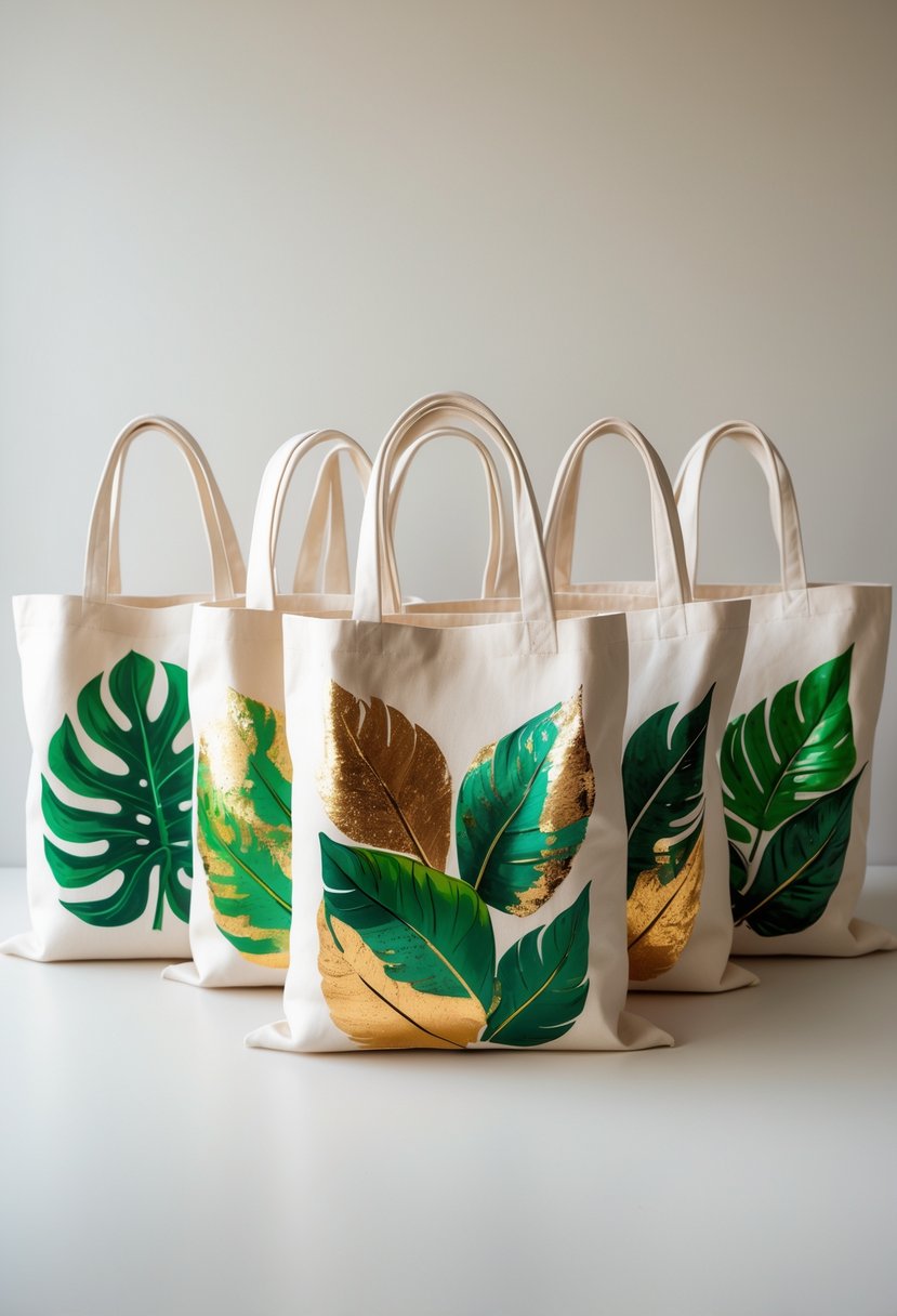
I layer different greens to make the leaves look more real.
Gold highlights on the edges or veins give it just enough shine without going overboard.
8. Dainty polka dots in varying sizes
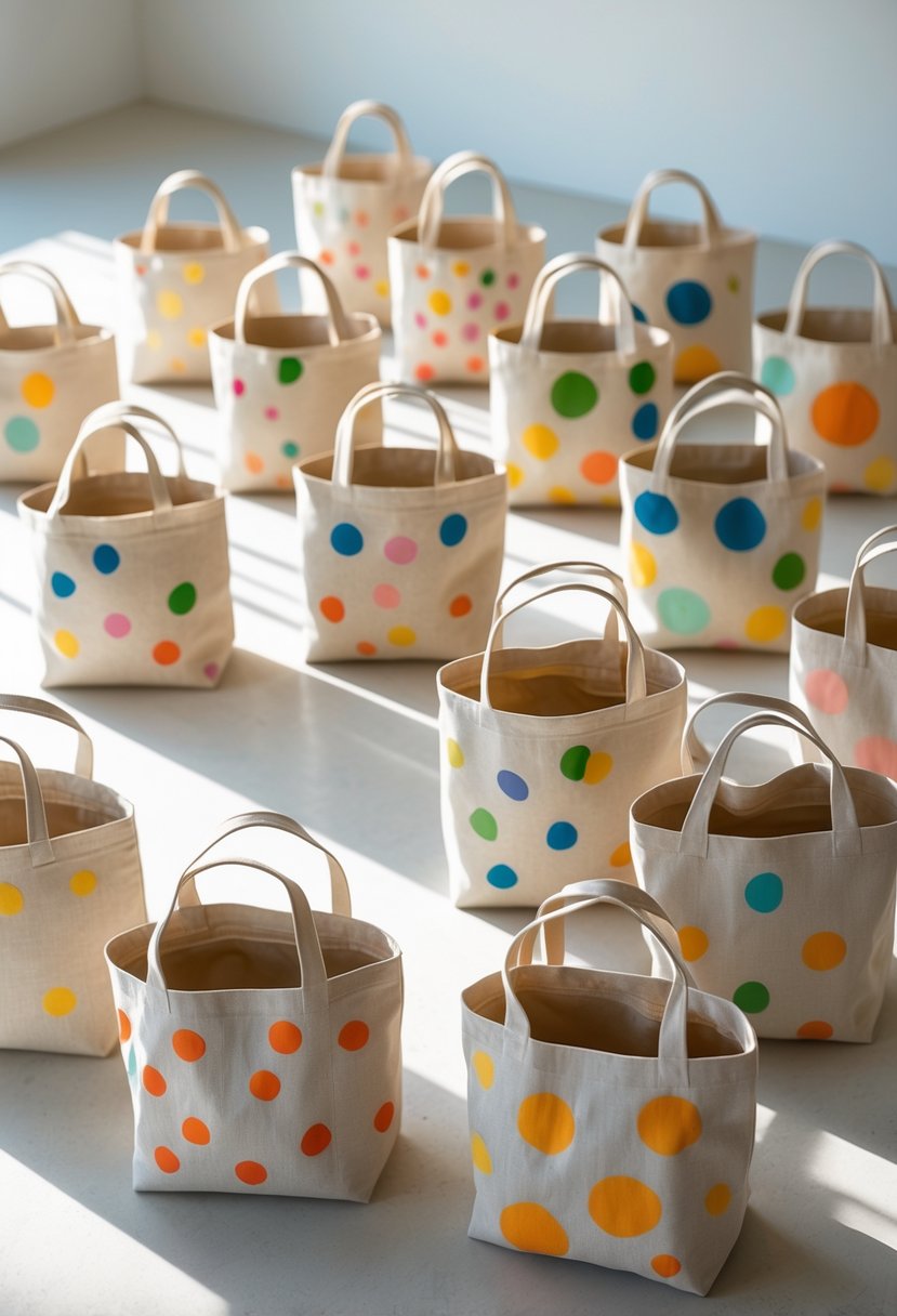
I use a round brush or dotting tool for neat circles, mixing up the sizes for some variety.
That mix keeps things balanced—never too busy, never too plain.
9. Sunset gradient ombre effect
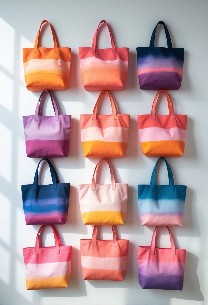
I blend warm yellows, oranges, and pinks into soft purples and blues for a sunset gradient.
Wide, horizontal brush strokes seem to work best for smooth transitions—though I’ll admit, sometimes I mess it up and just call it “abstract.”
10. Cartoon-style fruit illustrations

I paint simple, bold-outlined fruit—apples, strawberries, bananas, whatever’s easy to recognize.
Keeping it playful just makes the tote feel happy, you know?
11. Mandala patterns in vibrant hues
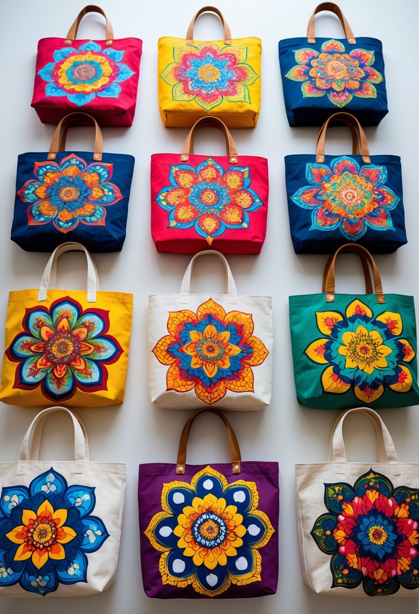
I go for detailed mandala shapes—lots of little lines and dots.
Bright colors like turquoise or pink really pop, and I stick to acrylics with tiny brushes for those crisp edges.
12. Retro 70s-inspired swirls and stars
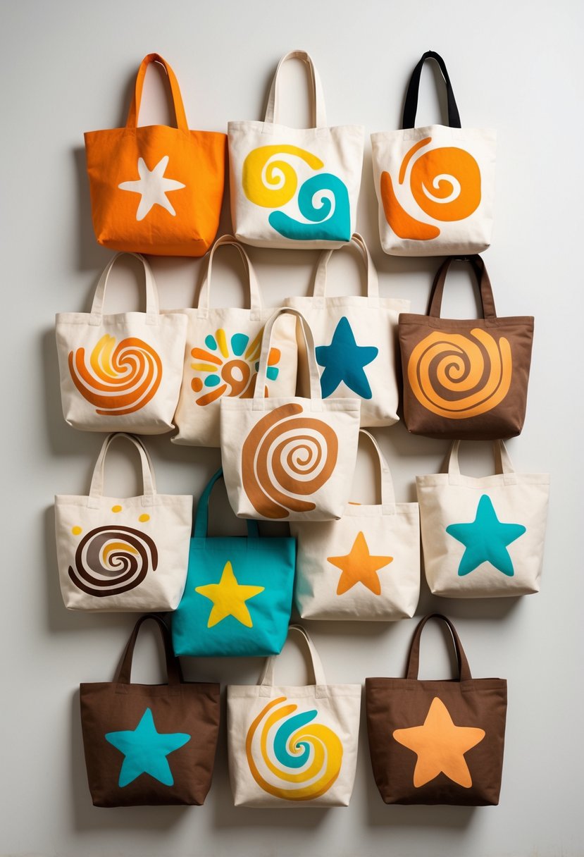
Big, bold swirls in warm colors—think orange, yellow, brown. It’s got that groovy vibe.
I add little stars in between for some extra sparkle, then heat-set the whole thing so it doesn’t fade after one wash.
13. Cute kawaii characters with big eyes
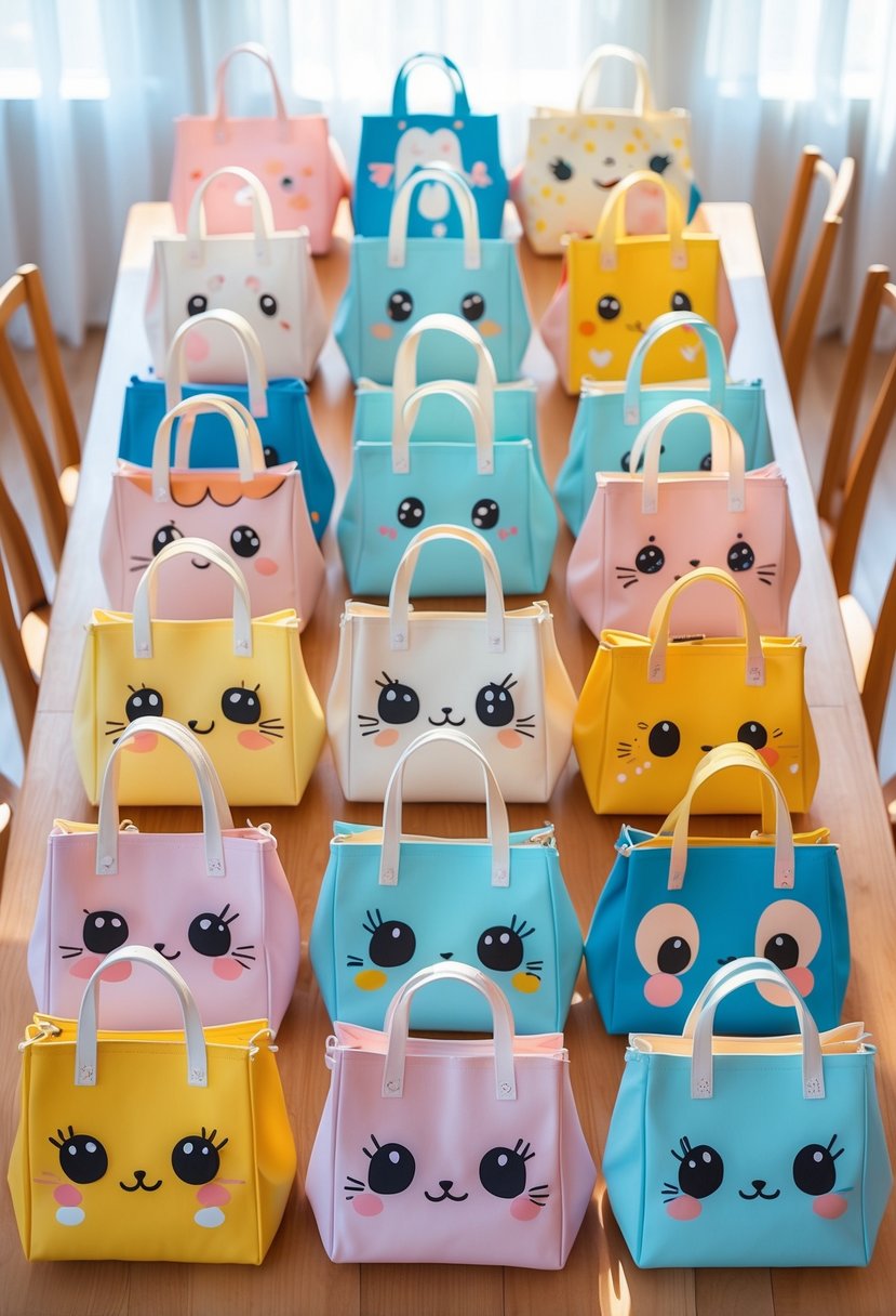
Kawaii characters with oversized eyes are just so fun to paint—they always catch attention.
I keep the rest of the colors soft and simple so the eyes really pop.
14. Galaxy-themed paint with stars and planets

I start with a dark background to give that outer space feel.
Then, I dot on stars and add bigger circles for planets—sometimes blending blues, purples, and pinks to make the sky look deeper.
15. Monogram initials with floral borders
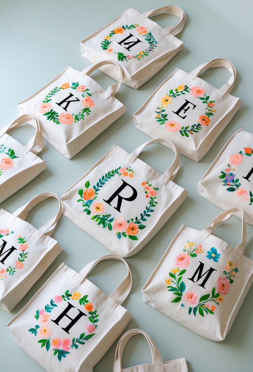
I usually paint a single initial right in the center of the tote.
Next, I’ll add a border of tiny flowers circling the letter—nothing too complicated, just enough to give it a little charm.
Honestly, this design feels neat and personal, but it doesn’t go overboard with details.